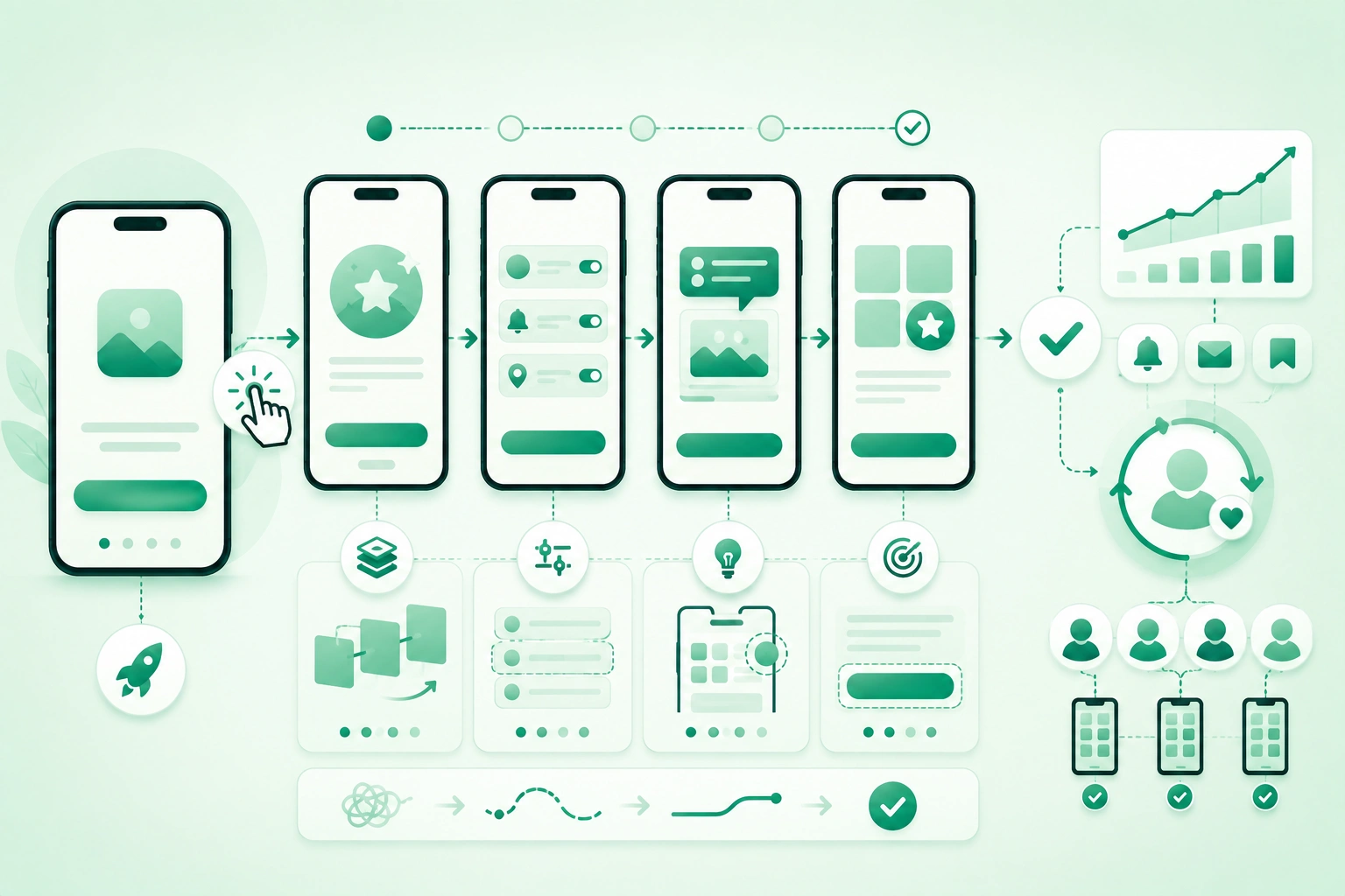
Mobile onboarding is often treated as:
install
  ↓
four tutorial screens
  ↓
create account
  ↓
allow notifications
  ↓
allow location
  ↓
home screen
That sequence may explain the product, but it does not necessarily help the user experience value.
A stronger onboarding question is:
What is the shortest trustworthy path
from first launch
to the user's first meaningful success?
For one application that could be:
save first articleFor another:
connect bank accountor:
create first projector:
send first messageOnboarding is not a slideshow
Onboarding is the complete sequence of product experiences that helps a new user become successful. Intro screens, registration, permissions, empty states, checklists, contextual tips, sample data, lifecycle messages, and first-run defaults are all possible parts of onboarding, but none is mandatory by itself.
1. Define activation before designing onboarding
Mobile onboarding activation funnel (diagram)

An activation event should represent meaningful product value rather than an administrative step.
Weak activation definition
registration completedRegistration may be required, but it does not prove the user experienced the core value.
Stronger examples
project app:
first project created

finance app:
first account synchronized

marketplace:
first saved item

messaging:
first conversation started

fitness:
first workout recorded
Use behavioral evidence
A useful activation event should ideally correlate with:
future product use
or
successful task completion
Activation can have stages
technical activation:
account connected

behavioral activation:
first useful action

habit activation:
valuable action repeated
This prevents one early event from becoming the only success metric.
Map the funnel
install
 ↓
first launch
 ↓
onboarding start
 ↓
account / guest mode
 ↓
first core action
 ↓
activation
 ↓
return usage
Then measure where people leave.
2. Minimize time-to-value
Time-to-value is the interval between:
first meaningful product entry

and

first useful outcome
Every extra step needs a reason
Consider:
Welcome
 ↓
Feature 1
 ↓
Feature 2
 ↓
Feature 3
 ↓
Feature 4
 ↓
Create account
 ↓
Select interests
 ↓
Enable notifications
 ↓
Enable contacts
 ↓
Home
Ask what can be removed, delayed, inferred, or moved into the product itself.
Show value before configuration when possible
A budgeting application might display:
sample dashboardbefore asking the user to connect a real account.
Use sensible defaults
Do not ask:
12 configuration questionsif most users can succeed with reasonable defaults and adjust later.
Remove duplicate information collection
If an account provider already gives:
name
email
avoid asking for the same data again without a product reason.
3. Choose onboarding patterns by friction
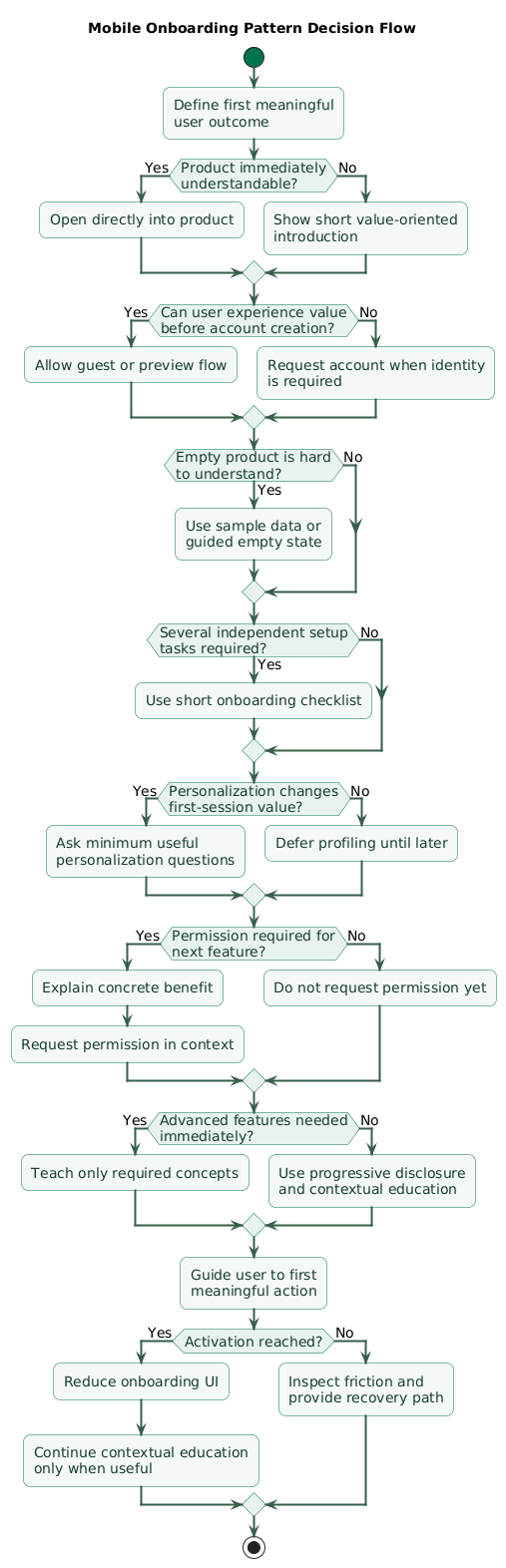
Mobile onboarding pattern decision flow (diagram)
Direct-to-product onboarding
Best when:
product purpose is obvious
and
user can act immediately
Example:
calculator
simple scanner
basic note app
Benefit-oriented introduction
Useful when the product requires a small amount of context before use.
Keep it short:
what it does
why it helps
what happens next
Checklist onboarding
Useful when activation requires several independent setup tasks:
Connect calendar
Invite teammate
Create project
Enable integration
Progressive onboarding
Teach:
feature
when
user encounters it
instead of teaching the entire product at first launch.
Sample-data onboarding
Useful for products whose empty state cannot communicate value well.
Examples:
analytics dashboard
project board
finance dashboard
charting application
Interactive onboarding
Instead of:
slide:
"Tap + to create a task"
let the user:
tap +
create real task
receive immediate result
4. Delay account creation when possible
Registration creates friction because it introduces:
- Typing.
- Password decisions.
- Email verification.
- Privacy questions.
- Authentication failures.
Ask whether an account is actually required yet
A photo editor may allow:
select photo
 ↓
edit photo
 ↓
preview result
before account creation.
Require identity where necessary
Account creation is justified earlier when the product needs:
cloud synchronization
payments
security-sensitive data
cross-device history
team membership
Guest mode
A guest experience can shorten time-to-value, but plan migration:
guest creates data
 ↓
user registers
 ↓
guest data attaches to account
Do not discard guest work
Losing:
10 minutes of setupbecause the user registered is an avoidable retention problem.
Make authentication choices understandable
If you offer:
email
Apple
Google
enterprise SSO
keep the screen focused and avoid unnecessary duplication.
5. Personalize without interrogating the user
Personalization can increase relevance, but every question increases friction.
Ask only what changes the immediate experience
Good:
Which topics do you want to follow?when it determines the initial feed.
Weak:
What is your job title?

How large is your company?

Which department?

What are your goals?

How did you hear about us?
before the user has seen the product.
Use progressive profiling
first session:
minimum information

later:
ask when additional information
improves a specific feature
Make personalization reversible
Users should be able to change:
topics
goals
notification preferences
default views
later.
Avoid pretending inferred data is certain
If a personalization engine guesses:
user likes travelallow the experience to adapt when that assumption is wrong.
6. Request permissions in context
A first-launch sequence such as:
Allow notifications?

Allow location?

Allow contacts?

Allow camera?
asks users to trust features they have not yet experienced.
Use contextual permission requests
User taps:
Scan receipt

      ↓

Explain:
Camera access is needed
to scan your receipt

      ↓

System camera permission
Notifications
Ask after the user expresses:
I want to know
when this changes
For example:
Notify me when price dropsLocation
Ask when location enables:
nearby results
navigation
local weather
delivery location
Handle denial gracefully
Do not treat:
permission deniedas:
application unusableunless the feature genuinely cannot function without it.
Do not repeatedly pressure the user
If a permission has been denied, continue providing useful alternatives and explain system settings only when the user later attempts the relevant feature.
7. Turn empty states into activation surfaces
New users often see:
No projectswhich explains the database state but not what to do.
Better empty state
No projects yet

Projects keep tasks, files,
and conversations together.

[ Create your first project ]
Good empty states answer three questions
What is this?

Why should I care?

What should I do next?
Use sample data where explanation is difficult
A dashboard containing:
0
0
0
0
may communicate less than an obviously labeled sample dashboard showing what useful data will eventually look like.
Do not confuse sample data with real data
Mark it clearly:
Example dashboardand give the user an obvious path to replace it.
8. Use checklists only when setup has several real tasks
Checklists are effective when users need to complete independent tasks.
Example
Getting started

[x] Create workspace
[ ] Invite teammate
[ ] Connect calendar
[ ] Create first project
Each item should produce real value
Weak:
[ ] Watch our intro video
[ ] Read about features
[ ] Visit settings
unless those steps are actually required.
Do not make optional tasks feel mandatory
Label optional setup clearly.
Allow dismissal
An experienced user or returning user may not need:
Getting Started
0 / 5
permanently pinned to the interface.
Completion should be event-driven
If a user creates a project through another route, the checklist should recognize:
Create first project:
complete
automatically.
9. Teach advanced features progressively
First-time users do not need to understand:
every feature
every setting
every gesture
every integration
before using the product.
Contextual education
When the user first reaches:
Advanced filtersshow:
Combine filters to narrow
large result sets.
Avoid tutorial overlays over the entire interface
Long coach-mark sequences can become:
Next
Next
Next
Skip
without creating understanding.
One tip per context
Teach:
the next useful conceptinstead of:
the complete product manualDo not repeat education forever
Persist:
tip seen
feature used
task completed
where appropriate.
Keep help discoverable
Dismissing a tip should not permanently remove access to:
Help
Learn
Documentation
What's this?
10. Design onboarding for errors and interruptions
Real onboarding is interrupted by:
- Calls.
- Network loss.
- App backgrounding.
- Process termination.
- Email verification.
- Permission denial.
Persist progress
step 1 complete
step 2 complete

app killed

reopen

resume at appropriate state
Do not restart unnecessarily
Requiring users to repeat:
profile questions
account connection
permissions
intro screens
after interruption creates frustration.
Network errors need recovery
Bad:
Something went wrongBetter:
We couldn't create your workspace.

Your information is still saved.

[ Try again ]
Never duplicate actions after retry
If onboarding creates:
workspace
subscription
order
profile
server-side operations should tolerate retry safely.
Returning users
A user who reinstalls or changes device may already understand the product.
Once identity is restored:
skip irrelevant beginner setup
restore preferences
restore progress where appropriate
11. Keep onboarding accessible
Onboarding is especially risky because it often contains:
custom illustrations
swipe-only pages
tiny Skip buttons
animated transitions
coach marks
custom progress indicators
Screen readers
Verify that:
- Page titles are understandable.
- Primary actions are reachable.
- Decorative artwork is ignored.
- Progress is announced meaningfully.
Do not require horizontal swipe alone
If onboarding pages advance via:
swipe leftprovide:
Nextas a clear action.
Large text
Test:
headline
description
primary button
secondary button
at large system text settings.
Reduced motion
Large animated onboarding transitions should respect platform motion preferences.
Do not make Skip difficult to reach
If onboarding is optional:
Skipshould be a real accessible action, not faint decorative text in the corner.
12. Measure activation, not tutorial completion
A metric such as:
92% completed onboarding slidesis not enough.
Measure the complete funnel
first launch
 ↓
onboarding viewed
 ↓
registration started
 ↓
registration completed
 ↓
first product action
 ↓
activation
 ↓
day / week return
Measure time-to-value
activation timestamp
-
first launch timestamp
Find abandonment points
Example:
First launch:
10,000

Started registration:
8,500

Email verification:
5,900

Activation:
3,100
The major opportunity may be:
verification frictionrather than the intro slides.
Compare retention by activation
Compare:
users who activated

vs

users who did not
to validate whether the selected activation event actually represents value.
Segment carefully
Useful dimensions may include:
acquisition source
platform
app version
country / locale
new vs returning user
while respecting privacy and minimizing unnecessary tracking.
13. Experiment with guardrail metrics
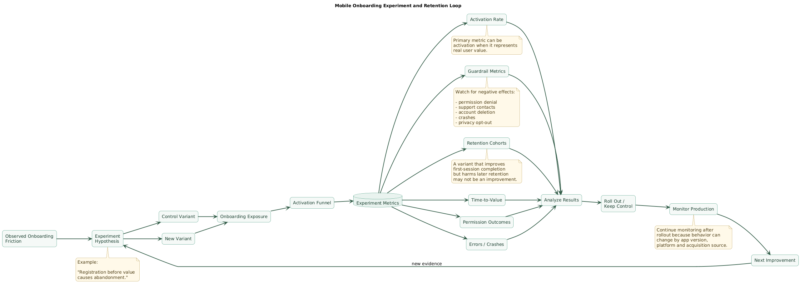
Onboarding experiment and retention loop (diagram)
Start with a hypothesis
Users abandon because
registration appears
before they understand value.
Experiment
Control:
registration first

Variant:
guest preview
then registration
Primary metric
activation rateSecondary metrics
time-to-value
registration rate
error rate
day-7 retention
Guardrails
support contacts
account deletion
permission denial
crashes
fraud / abuse
privacy opt-out
Do not optimize only onboarding completion
Removing:
important setup stepmay increase completion while decreasing:
later product successMeasure downstream retention
A variant that improves:
first-session activationbut harms:
week-4 retentionmay not be an improvement.
Run experiments on meaningful changes
High-value tests include:
- Registration before versus after value.
- Checklist versus contextual guidance.
- Sample data versus empty state.
- Permission timing.
- Personalization depth.
Monitor after rollout
Even a successful experiment should continue to be watched for:
platform regressions
new app versions
new traffic sources
behavior changes
14. Copy/paste onboarding checklist
Mobile app onboarding checklist

Strategy
- Define core product value.
- Define activation event.
- Validate activation against later retention.
- Define first successful user outcome.
- Measure time-to-value.
- Map major onboarding friction.
- Avoid treating onboarding slides as the goal.

Activation
- Choose behavioral activation event.
- Avoid registration-complete as only activation metric.
- Avoid tutorial-complete as only activation metric.
- Track first activation.
- Track repeated valuable action.
- Compare activated and non-activated cohorts.
- Revisit activation definition when product changes.

First launch
- Explain value quickly.
- Avoid unnecessary modal dialogs.
- Avoid multiple permission prompts.
- Avoid mandatory tutorial when product is obvious.
- Keep first action visible.
- Handle network failure.
- Handle returning user.

Intro screens
- Use only when they improve understanding.
- Keep number small.
- Explain benefits, not internal features.
- Keep primary action obvious.
- Provide Skip when optional.
- Persist completion.
- Do not show repeatedly after every update.

Direct entry
- Consider opening directly into product.
- Use when product is self-explanatory.
- Provide contextual hints later.
- Keep help discoverable.
- Avoid blocking user with unnecessary education.

Time-to-value
- Count every required step.
- Remove duplicate inputs.
- Delay optional configuration.
- Use sensible defaults.
- Prefill known information.
- Defer advanced settings.
- Keep core action reachable quickly.

Registration
- Ask only when identity is required.
- Consider guest mode.
- Preserve guest data after registration.
- Keep form short.
- Support password managers.
- Support appropriate sign-in providers.
- Handle verification failure.
- Resume after email verification.

Guest mode
- Give useful product experience.
- Store guest data safely.
- Plan guest-to-account migration.
- Avoid deleting work after sign-up.
- Explain what registration adds.
- Handle multi-device limitations clearly.

Social sign-in
- Keep options understandable.
- Handle canceled authentication.
- Handle existing-account linking.
- Handle email conflicts.
- Avoid duplicate accounts.
- Test logout and re-login.
- Respect platform sign-in requirements.

Personalization
- Ask only questions that improve immediate experience.
- Keep initial questions minimal.
- Make answers editable.
- Use progressive profiling.
- Avoid unnecessary sensitive attributes.
- Allow Skip where reasonable.
- Provide useful defaults.

Progressive profiling
- Ask later in relevant context.
- Explain why information helps.
- Avoid repetitive questions.
- Store previous answers.
- Allow correction.
- Stop asking after user declines where appropriate.

Permissions
- Request in context.
- Explain clear benefit.
- Ask camera when camera feature begins.
- Ask location when location feature begins.
- Ask notifications after notification-related intent.
- Avoid permission batching.
- Handle denial gracefully.
- Re-check current system state.

Notification permission
- Connect request to user value.
- Avoid first-launch request without context.
- Support Not Now.
- Respect denial.
- Do not repeatedly nag.
- Offer settings guidance only when user later wants the feature.

Location
- Ask only at relevant feature.
- Request minimum necessary scope.
- Support manual location where possible.
- Explain why precision is needed if applicable.
- Handle denial.
- Handle changed system settings.

Camera
- Ask when scan / capture begins.
- Provide alternative input where practical.
- Handle denial.
- Handle camera unavailable.
- Test limited hardware.

Contacts
- Avoid requesting entire contact access unless required.
- Explain use.
- Consider manual invite alternative.
- Do not block unrelated product use.
- Handle empty contact list.

Empty states
- Explain what feature is.
- Explain benefit.
- Show next action.
- Keep primary CTA clear.
- Avoid dead-end "No data" messages.
- Use examples where useful.
- Make examples visually distinct from real data.

Sample data
- Use when empty product is hard to understand.
- Label sample clearly.
- Allow removal.
- Replace with real content smoothly.
- Avoid sample values being mistaken for user data.
- Do not pollute analytics with sample actions.

Interactive onboarding
- Let users perform real action.
- Give immediate feedback.
- Avoid simulation when real action is safe.
- Save created content.
- Count successful action toward activation.
- Allow retry.

Checklists
- Use for multiple real setup tasks.
- Keep number manageable.
- Each item should create value.
- Mark completed items automatically.
- Allow optional items to be skipped.
- Allow checklist dismissal.
- Hide or minimize after completion.

Progress indicators
- Show progress only when useful.
- Avoid fake completeness.
- Do not imply optional steps are mandatory.
- Make progress accessible.
- Update accurately.
- Avoid motivating users through misleading percentages.

Coach marks
- Use sparingly.
- Show one contextual concept at a time.
- Avoid covering key UI.
- Allow dismissal.
- Persist seen state.
- Keep help available elsewhere.
- Test screen-reader behavior.

Tooltips
- Use for non-obvious controls.
- Keep concise.
- Avoid repeating obvious labels.
- Do not make tooltips the only documentation.
- Make dismissible.
- Test large text.
- Test accessibility focus.

Progressive disclosure
- Hide advanced complexity initially.
- Reveal when relevant.
- Preserve discoverability.
- Do not hide critical settings.
- Give experts efficient access.
- Remember user choices.

Defaults
- Use safe defaults.
- Use common defaults.
- Avoid defaults that create privacy surprise.
- Allow changes.
- Avoid forcing setup where default works.
- Keep destructive defaults conservative.

First content creation
- Reduce required fields.
- Mark optional fields.
- Pre-fill safe defaults.
- Validate inline.
- Preserve data after errors.
- Save draft when appropriate.
- Confirm successful creation.

Forms
- Keep fields necessary.
- Use appropriate keyboards.
- Support autofill.
- Use persistent labels.
- Explain errors clearly.
- Preserve entered data.
- Make submit action reachable.
- Handle large text.

Validation
- Validate near relevant field.
- Avoid waiting until final submit when early validation helps.
- Do not validate aggressively while typing where disruptive.
- Explain correction.
- Move accessibility focus appropriately.
- Preserve valid fields.

Error recovery
- Explain what failed.
- Explain whether progress is saved.
- Provide retry.
- Prevent duplicate submission.
- Handle offline.
- Handle timeout.
- Handle server error.
- Handle expired authentication.

Offline onboarding
- Decide which steps work offline.
- Cache progress.
- Queue safe operations where appropriate.
- Explain connectivity requirement.
- Resume after network returns.
- Avoid losing entered data.

Interruption
- Persist onboarding state.
- Handle background.
- Handle process death.
- Handle device restart where relevant.
- Resume appropriate step.
- Avoid repeating completed permissions.
- Avoid repeating completed profile questions.

Returning users
- Detect restored account.
- Skip irrelevant beginner introduction.
- Restore preferences.
- Restore checklist state.
- Handle reinstall.
- Handle new device.
- Respect changed product capabilities.

Multiple devices
- Sync onboarding completion where appropriate.
- Sync account-level preferences.
- Keep device-specific permissions separate.
- Avoid showing full onboarding on every new device unnecessarily.
- Explain device-specific setup where needed.

Lifecycle messaging
- Continue education after first session.
- Use contextual in-app messages.
- Avoid excessive email and push.
- Tie messages to unfinished useful tasks.
- Stop reminders after completion.
- Respect communication preferences.

Re-engagement
- Identify meaningful unfinished activation.
- Use relevant reminder.
- Avoid generic pressure.
- Limit frequency.
- Stop after repeated non-response.
- Deep-link to useful continuation.
- Respect notification permission.

Deep links
- Route campaigns to correct onboarding step.
- Handle logged-out state.
- Handle already-completed setup.
- Avoid reopening obsolete onboarding.
- Keep destination safe.
- Test cold and warm starts.

Accessibility
- Test VoiceOver.
- Test TalkBack.
- Keep Skip reachable.
- Expose page title.
- Expose progress.
- Hide decorative illustrations.
- Provide buttons in addition to swipe gestures.
- Test large text.
- Respect reduced motion.

Touch
- Keep controls comfortably tappable.
- Avoid tiny Skip links.
- Add spacing.
- Avoid gesture-only actions.
- Test one-handed use.

Text scaling
- Test large accessibility fonts.
- Allow wrapping.
- Avoid fixed-height cards.
- Keep CTA visible.
- Allow scroll where needed.
- Test smallest supported screen.

Motion
- Respect reduced-motion settings.
- Avoid unnecessary parallax.
- Avoid forced animated tours.
- Keep feedback visible when motion reduced.
- Avoid flashing.

Privacy
- Collect minimum onboarding data.
- Explain sensitive information requests.
- Avoid unnecessary profiling.
- Delay optional tracking choices until context is clear.
- Keep consent separate from product manipulation.
- Respect opt-out.

Analytics
- Track first launch.
- Track onboarding start.
- Track each meaningful step.
- Track registration start.
- Track registration completion.
- Track permission prompt.
- Track permission result.
- Track activation.
- Track time-to-value.
- Track abandonment.

Event design
- Use stable event names.
- Include app version.
- Include onboarding variant.
- Avoid sensitive payloads.
- Avoid recording passwords or tokens.
- Keep event definitions documented.
- Version major schema changes.

Funnel
- First launch.
- Intro viewed.
- Registration started.
- Registration completed.
- Setup started.
- First core action.
- Activation.
- Return usage.
- Identify largest drop.
- Analyze by cohort.

Retention
- Compare activated cohort.
- Compare non-activated cohort.
- Track day / week return where meaningful.
- Track repeated core action.
- Avoid optimizing onboarding completion without downstream retention.

Time-to-value
- Record first-launch timestamp.
- Record activation timestamp.
- Calculate distribution, not only average.
- Compare variants.
- Compare device classes.
- Compare acquisition sources carefully.

Experiments
- Write hypothesis.
- Define control.
- Define variant.
- Choose primary metric.
- Choose guardrails.
- Estimate required sample.
- Avoid changing too many things at once.
- Analyze downstream effects.

Experiment ideas
- Registration before vs after preview.
- Empty state vs sample data.
- Checklist vs contextual onboarding.
- Short vs long personalization.
- Permission timing.
- Guest mode vs immediate account.
- Interactive onboarding vs tutorial screens.

Experiment guardrails
- Error rate.
- Crash rate.
- Permission denial.
- Support contacts.
- Uninstall signals.
- Account deletion.
- Privacy opt-out.
- Fraud / abuse.
- Longer-term retention.

Dark patterns
- Do not hide Skip intentionally.
- Do not fake urgency.
- Do not force optional permissions.
- Do not preselect invasive choices deceptively.
- Do not make decline visually impossible.
- Do not trap users inside onboarding.
- Do not confuse consent with core functionality.

Performance
- Keep onboarding startup fast.
- Compress illustrations.
- Avoid huge video assets.
- Avoid blocking API calls.
- Show useful loading state.
- Preload only necessary data.
- Measure slow first launch.

Localization
- Localize onboarding copy.
- Test text expansion.
- Test right-to-left.
- Avoid screenshots containing hard-coded language.
- Localize illustrations where necessary.
- Test date / currency examples.
- Avoid assumptions about name format.

Small screens
- Test all onboarding steps.
- Test keyboard open.
- Test large text.
- Keep CTA reachable.
- Allow content scrolling.
- Avoid fixed vertical layouts.

Tablets
- Avoid stretching phone onboarding awkwardly.
- Use appropriate layout.
- Preserve reading order.
- Keep controls grouped.
- Test multi-window where supported.

Orientation
- Preserve progress.
- Keep fields populated.
- Avoid restart.
- Keep current step.
- Test media resizing.

Design system
- Standardize onboarding buttons.
- Standardize empty states.
- Standardize permission explanation.
- Standardize progress indicators.
- Standardize form errors.
- Standardize coach marks.
- Standardize accessibility.

Engineering architecture
- Keep onboarding state explicit.
- Separate product state from presentation.
- Persist completed milestones.
- Make steps idempotent.
- Support feature flags.
- Support experiment variants.
- Avoid deeply hard-coded step order.

Server state
- Keep account-level milestones authoritative where needed.
- Avoid stale analytics deciding critical access.
- Re-check eligibility.
- Make repeated setup operations safe.
- Handle retry.
- Handle partial completion.

Feature flags
- Allow gradual rollout.
- Keep old and new flow compatible during experiment.
- Track variant.
- Avoid user switching between variants unexpectedly.
- Remove obsolete variants after decision.

QA
- Fresh install.
- Returning user.
- Guest user.
- Logged-in user.
- Slow network.
- Offline.
- Permission denied.
- App killed mid-flow.
- Email verification.
- Large text.
- Screen reader.

Release testing
- Fresh production-like install.
- Complete onboarding.
- Verify analytics.
- Verify permissions.
- Verify activation event.
- Verify deep links.
- Verify account recovery.
- Verify state after restart.
- Verify upgrade behavior.

Regression monitoring
- Track activation by app version.
- Track errors by step.
- Track time-to-value.
- Track permission denial.
- Track crash rate.
- Track retention.
- Compare release cohorts.
- Investigate sudden funnel changes.

Final review
- What is the activation event?
- Does it represent real user value?
- How many steps exist before activation?
- Can any step be removed or delayed?
- Is registration required this early?
- Can the user experience value as a guest?
- Are personalization questions necessary now?
- Are permissions requested in context?
- Does every empty state have a useful next action?
- Does a checklist contain only meaningful setup work?
- Are advanced features taught progressively?
- Is onboarding progress preserved after interruption?
- Are retries safe?
- Do returning users avoid unnecessary beginner flows?
- Is onboarding accessible with VoiceOver and TalkBack?
- Does large text work?
- Is reduced motion respected?
- Are analytics events defined?
- Is time-to-value measured?
- Is activation compared with downstream retention?
- Are experiments evaluated with guardrail metrics?
- Does onboarding progressively disappear as the user becomes competent?
15. FAQ
What is activation in mobile onboarding?
Activation is a meaningful behavior showing that the user experienced the product's core value, such as creating a first project, connecting an account, saving an item, sending a message, or completing another high-value action.
Does every application need onboarding screens?
No. If users can understand and use the product immediately, direct entry may provide a better experience. Introductory screens should exist only when they reduce confusion or meaningfully improve first use.
Should registration happen before users enter the app?
Only when identity is required for security, synchronization, payment, or the next meaningful action. Otherwise, allowing users to experience some value before registration can reduce friction.
What is progressive onboarding?
Progressive onboarding teaches features when they become relevant instead of explaining the entire application during the first session. It can use contextual tips, empty states, help, checklists, or feature-specific education.
When should onboarding ask for permissions?
Ask when the related feature is being used and the benefit is clear. For example, request camera permission when scanning starts and notification permission after a user enables an alert.
What onboarding metrics matter most?
Useful metrics include activation rate, time-to-value, funnel abandonment, errors, permission outcomes, activation by cohort, and retention after activation. Tutorial completion alone rarely tells the whole story.
Can onboarding hurt retention?
Yes. Long forms, premature permission requests, forced tutorials, irrelevant personalization, poor error recovery, or manipulative patterns can cause users to leave before they experience meaningful value.
Key terms (quick glossary)
- Onboarding
- The set of experiences that helps a new or returning user understand, configure, and successfully begin using a product.
- Activation
- A meaningful product behavior indicating that a new user has experienced an important part of the application's value.
- Time-to-value
- The elapsed time between entering the product and reaching the first meaningful outcome.
- Progressive onboarding
- Teaching product concepts gradually when they become relevant rather than presenting all education before product use.
- Progressive disclosure
- Revealing additional complexity only when the user needs it.
- Progressive profiling
- Collecting optional user information gradually over time instead of asking for every preference during the first session.
- Empty state
- An interface shown when no user content exists yet, often used to explain value and provide a clear next action.
- Sample data
- Demonstration content used to show what a populated application can look like before the user creates real data.
- Onboarding checklist
- A visible set of meaningful setup or activation tasks that can help users make progress through a multi-step product configuration.
- Coach mark
- A contextual overlay or hint that highlights a particular feature or interface element.
- Guest mode
- A product mode that allows some application functionality before the user creates or authenticates an account.
- Activation funnel
- A sequence of measurable steps between first product entry and the defined activation event.
- Cohort
- A group of users sharing a characteristic such as signup date, acquisition source, onboarding variant, or activation status.
- Guardrail metric
- A metric monitored during an experiment to detect negative side effects even if the primary metric improves.
- Retention
- Continued useful product engagement after the initial onboarding and activation period.
- Dark pattern
- Interface design that manipulates users into choices they might not otherwise make, such as hiding decline actions or forcing unnecessary permissions.
Worth reading
Recommended guides from the category.