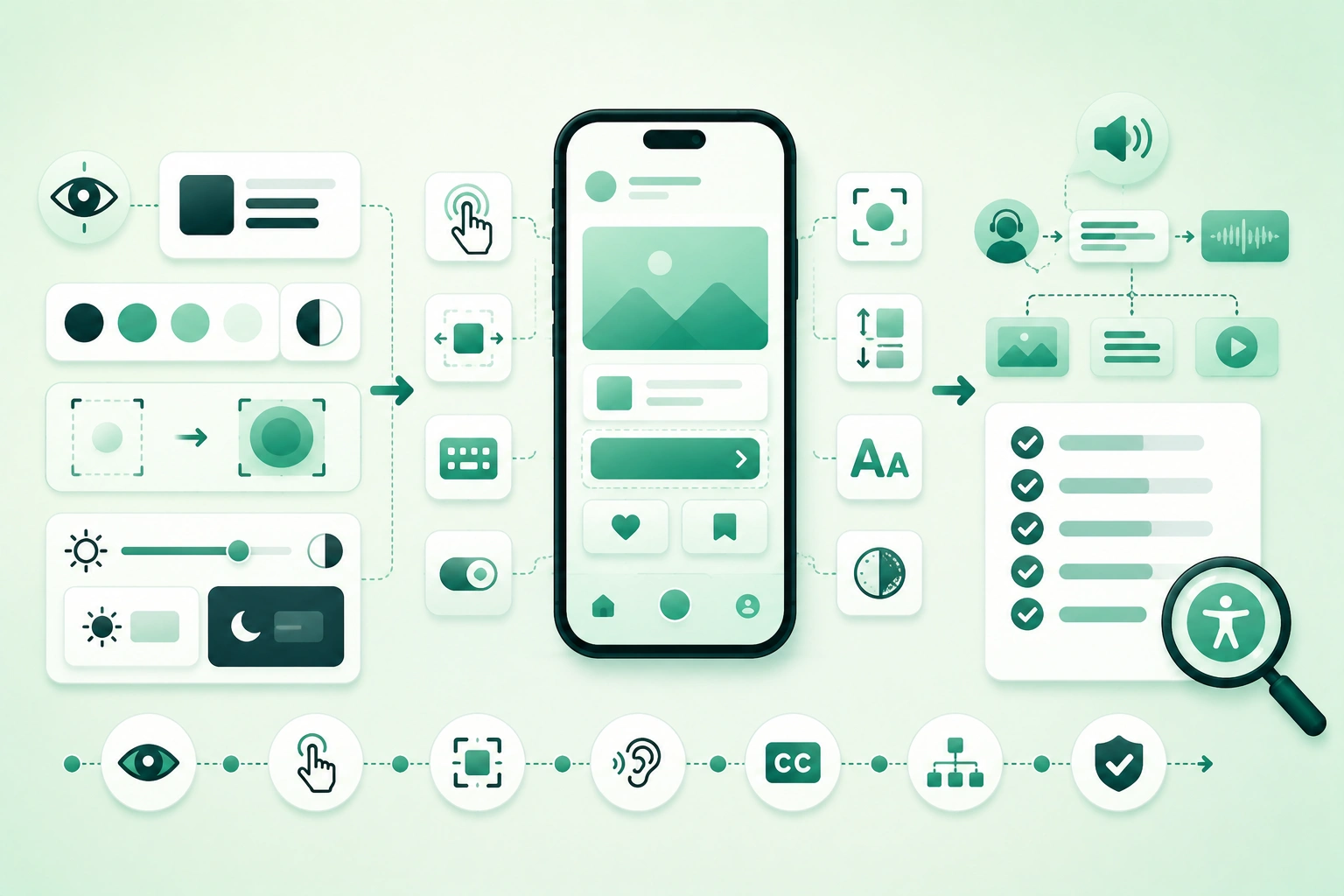
Mobile accessibility is not:
add labels before release
      ↓
done
It affects the complete interaction model.
A feature can look perfect and still be unusable because:
- A screen reader cannot identify the main button.
- Focus jumps through elements in a confusing order.
- An action exists only as a swipe gesture.
- Large text clips the confirmation button.
- Red and green are the only indicators of status.
- A modal opens while assistive focus remains behind it.
Accessibility therefore belongs in:
design system
component implementation
navigation
testing
code review
release validation
Start with platform controls
Standard Android, UIKit, and SwiftUI controls already expose useful accessibility behavior in many common cases. The more custom your interaction becomes, the more semantic behavior you must recreate and test yourself.
1. Treat accessibility as application behavior
Mobile accessibility layers (diagram)
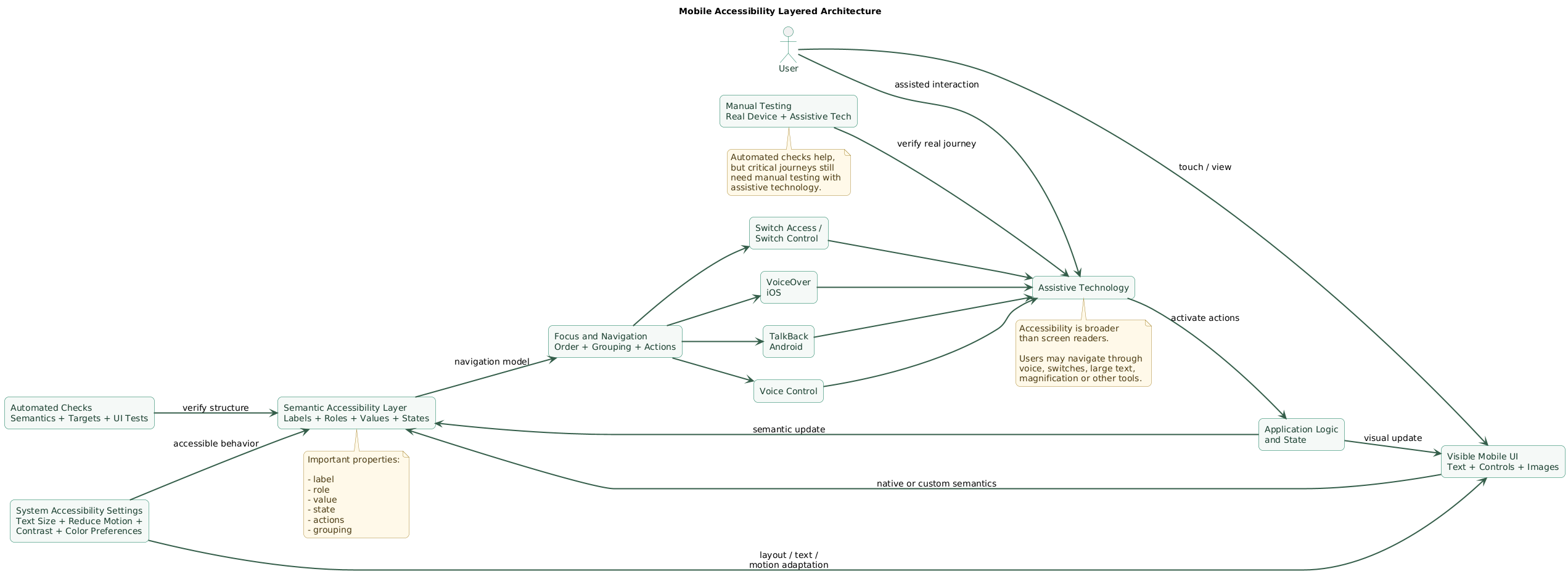
The visible interface is only one representation of your application.
Assistive technologies often consume a semantic representation containing concepts such as:
label
role
value
state
action
group
focus order
A visual component might show:
[ heart icon ] 127but the useful semantic meaning could be:
Favorite

Button

Not selected

127 favorites
Accessibility is broader than screen readers
Consider people using:
- VoiceOver.
- TalkBack.
- Voice Control.
- Switch Access.
- Large text.
- Reduced motion.
- External keyboards.
- Display magnification.
Test the task, not merely the screen
The goal is not:
every button has a labelbut:
user can understand
and complete the workflow
A checkout screen with technically labeled controls can still be inaccessible if the focus order is confusing or validation errors are never announced.
2. Start with semantic native controls
A native button already communicates:
this element is actionableto the platform.
A generic container with a tap handler may not.
Prefer semantic components
Use:
Button
Switch
Checkbox
TextField
Slider
rather than visually recreating those controls with generic drawing primitives whenever there is no strong reason.
Custom visuals can still use standard semantics
A custom card can visually look unique while exposing:
role:
button

label:
Open account settings
Do not expose every visual node
Suppose a list row contains:
avatar
user name
timestamp
decorative separator
chevron
Making all five elements independently focusable can create unnecessary navigation.
A better semantic representation might be:
Jane Smith
Last active 5 minutes ago
Button
Decorative graphics should normally disappear from the accessibility tree
An icon that merely decorates:
Settingsdoes not need an extra announcement:
gear icon
Settings
3. Expose useful labels, roles, values, and states
An accessible component often needs several dimensions of information.
Label
NotificationsRole
SwitchState
OnAction
toggleBad label
ButtonBetter
Save changesAvoid repeating the role unnecessarily
If the accessibility API already exposes:
role = buttona label such as:
Save buttonmay produce redundant speech.
Prefer:
SaveState must not be visual only
If a control changes:
gray
→
green
after selection, also expose:
selected
checked
on
enabled
as appropriate.
Keep labels short but meaningful
Weak:
Click this button to open
the settings screen where
you can change settings
Better:
SettingsAdd a hint only when the action is not obvious from context.
Update dynamic values
If a component changes from:
Download
0%
to:
Download
75%
its accessible value should reflect the new state.
4. Make focus order predictable
A user navigating without sight depends heavily on predictable ordering.
Visual layout
First name     Last name

Email          Phone
may produce an unexpected semantic order if custom grouping is incorrect.
Test linear navigation
Ask:
If I swipe through
every accessible element,
does the screen tell
a coherent story?
Group related content
A card containing:
Premium Plan

€9.99 / month

Renews September 10
may be easier to understand as one semantic group than three unrelated navigation stops.
Do not over-group interactive controls
If a card contains:
Open
Favorite
More actions
users still need access to each distinct action.
Modal focus
When a dialog appears:
background content
should not remain
the active navigation surface
The user should be able to understand:
- That a modal appeared.
- Its title or purpose.
- Its controls.
- How to dismiss it.
Dynamic content
If an error appears after submit, consider whether focus or an accessibility announcement needs to make that change discoverable.
Do not announce every small update, however. Excessive announcements can be as disruptive as missing ones.
5. Build forgiving touch targets and gesture alternatives
Accessible mobile component flow (diagram)
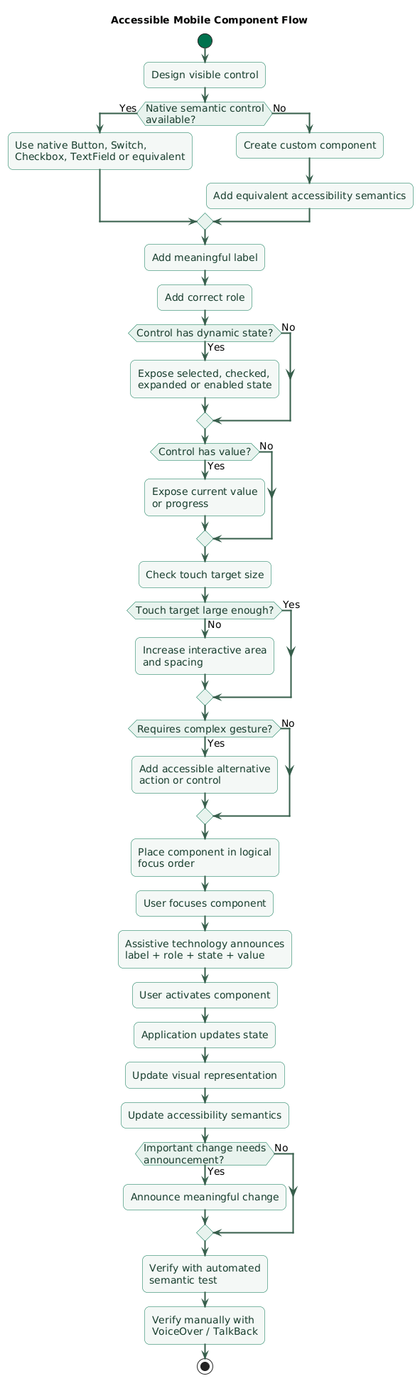
Small controls are difficult for users with:
- Limited dexterity.
- Tremor.
- Low vision.
- Temporary injuries.
- One-handed use.
Android
A practical platform target is:
at least 48 x 48 dp
for touch interaction
The visible icon itself can be smaller if its interactive area is large enough.
iOS and iPadOS
Apple uses:
44 x 44 ptas the default control size guidance.
Spacing matters too
Two:
48 x 48targets packed into a confusing arrangement can still be difficult to activate accurately.
Do not require complex gestures without an alternative
Example:
swipe left
to archive
should have an equivalent accessible action, menu item, or control.
Likewise:
drag to reordermay need actions such as:
Move up
Move down
Do not hide critical behavior behind long press alone
If long press reveals important functionality, expose the same functionality through discoverable accessibility actions or another interface.
6. Support Dynamic Type and font scaling
Hard-coded text layouts often work only at the developer's preferred font size.
Test much larger text
A screen that looks like:
[ Title ]

Description

[ Continue ]
can become:
[ Huge title that
  wraps to four lines ]

Long description
that requires
more vertical space

[ button pushed
  off screen ]
when users increase text size.
Apple Dynamic Type
Prefer text styles and APIs that participate in Dynamic Type rather than fixing important text to one absolute size.
UIKit controls can automatically respond to content-size-category changes when configured with scalable fonts.
Android font scaling
Test with enlarged system font settings and verify that:
- Text wraps.
- Buttons remain usable.
- Important content is not clipped.
- Rows can grow vertically.
Do not solve large text by shrinking it back
Bad:
user chooses larger font

app:
automatically scale down
until it fits
This defeats the purpose of the user's preference.
Allow layout to reflow
Horizontal:
Cancel Continuemay need to become:
Continue

Cancel
at large accessibility text sizes.
Watch fixed-height components
Fixed-height cards and buttons are common sources of clipped text.
7. Use sufficient contrast and never rely on color alone
This:
green = success

red = error
is incomplete.
Add:
icon
+
text
+
semantic state
Example
Weak:
Password

red border only
Better:
Password

[ error icon ]
Password must contain
at least 12 characters
Use system preferences
Apple platforms expose settings such as:
Differentiate Without Colorwhich can guide applications toward additional shapes, glyphs, or text where color would otherwise carry meaning.
Contrast
WCAG 2.2 is primarily a web accessibility standard, but its contrast thresholds are a useful cross-platform reference during design reviews.
Common Level AA reference values are:
normal text:
4.5 : 1

large text:
3 : 1

meaningful UI graphics:
3 : 1
Native applications should still follow their platform-specific accessibility and design requirements.
Test dark mode independently
Good contrast in:
light modedoes not guarantee good contrast in:
dark modeDisabled controls need care
A disabled state can be visually quieter, but users should still be able to understand what the control is and why it cannot currently be used when that information matters.
8. Respect motion, animation, and media preferences
Animation can improve understanding, but large movement can also cause discomfort.
Respect Reduce Motion
If the system indicates reduced motion, consider replacing:
large zoom transition
parallax
continuous background movement
with:
fade
instant state change
smaller transition
Do not remove functional feedback
Reduced motion should not mean:
no indication
that anything changed
Avoid unnecessary flashing
Rapid flashing or strobing can create serious accessibility concerns.
Treat flashing media and animated content as something requiring explicit design review, not as harmless decoration.
Audio needs alternatives
If a sound communicates:
upload failedalso provide:
visual
and semantic feedback
Video
Depending on the content, consider:
- Captions.
- Transcripts.
- Audio descriptions.
- Accessible media controls.
9. Make forms and errors understandable
Forms combine several common accessibility failure modes.
Use persistent labels
Weak:
[ Email address ]where the placeholder disappears after typing.
Better:
Email address
[ person@example.com ]
Associate errors with fields
When validation fails:
Email address
[ abc ]

Enter a valid email address
users need to know which field has the problem.
Do not rely on red borders
Error state needs:
text
+
semantics
+
optional icon / color
After submit
If there are multiple errors, consider:
focus first invalid field

or

announce error summary
according to the interaction.
Do not erase valid input after an error
A user correcting:
one invalid postal codeshould not have to re-enter:
name
email
address
phone
Keyboard and input configuration
Use suitable input types for:
- Email.
- Phone.
- Numbers.
- Passwords.
Correct platform semantics can make input easier for many users.
10. Make custom components equivalent to native controls
Custom components are often where accessibility breaks.
Custom star rating
Visual design:
★ ★ ★ ☆ ☆Accessibility needs to communicate something like:
Rating

3 of 5

Adjustable
with an accessible method to change the value.
Custom chart
A chart cannot be made accessible merely with:
contentDescription =
"chart"
Expose the useful information:
Revenue

January: 20,000
February: 24,000
March: 31,000

Up 55% since January
Custom swipe action
If sighted users can:
swipe left to deleteexpose:
Deleteas an accessibility action.
Custom canvas content
Drawing pixels does not automatically create a meaningful accessibility tree.
Create semantic elements representing:
meaningful controls
data
states
actions
Do not recreate platform behavior incompletely
A custom switch needs more than:
tap handler
+
animation
It needs:
role
state
label
activation behavior
focus behavior
touch target
11. Apply Android and iOS accessibility patterns
Android
TalkBack consumes semantic information about the interface.
In Jetpack Compose, semantics can expose:
content description
role
state description
toggle state
actions
Use Compose defaults where they fit
Components such as:
Button
Switch
Checkbox
already provide useful semantics.
Compose custom components
Use semantics deliberately when a custom component's meaning is not represented correctly by its underlying primitives.
Grouping
Related child nodes can sometimes be merged so TalkBack announces them as one coherent item.
Decorative Compose images
If an icon is purely decorative:
contentDescription = nullis often preferable to a redundant announcement.
Android custom actions
Swipe, drag, or other complex operations can expose named accessibility actions so users of TalkBack, Switch Access, or related services can complete the same task.
Apple platforms
UIKit and SwiftUI also provide accessibility behavior for many standard controls.
Custom elements may need:
label
value
hint
traits / role
custom actions
grouping
VoiceOver
Test by navigating sequentially through the interface rather than looking at the screen while tapping controls directly.
Screen Curtain can be useful when auditing whether the flow truly works without visual information.
Voice Control and Switch Control
A screen that works with VoiceOver can still contain interactions that are difficult with motor-access technologies.
Check that critical flows do not depend exclusively on:
precise touch
multi-finger gesture
dragging
long press
12. Test with assistive technology on real devices
Mobile accessibility testing workflow (diagram)

Start with one critical flow
launch app
      ↓
sign in
      ↓
open main feature
      ↓
complete task
      ↓
confirm result
VoiceOver test
Check:
Can every meaningful
element be reached?

Does each announcement
make sense?

Are decorative elements skipped?

Are states announced?

Can I activate every action?
TalkBack test
Repeat the same critical journey and inspect:
- Semantic labels.
- Roles.
- Actions.
- Grouping.
- Focus sequence.
Eyes-free test
Do not rely on looking at the screen while testing.
Ask:
Could I complete this
if the visual interface
were unavailable?
Large-text test
Increase the system font toward accessibility sizes and inspect:
- Clipping.
- Truncation.
- Overlapping controls.
- Off-screen actions.
- Broken navigation bars.
Reduce Motion
Turn it on and verify that:
major movement is reduced

but

state changes remain understandable
Differentiate Without Color
Verify that status, selection, errors, charts, and controls remain understandable without color as the only signal.
Motor-access test
Inspect whether critical controls:
are large enough
have sufficient spacing
have alternatives to gestures
Landscape and small screens
Accessibility settings frequently expose responsive-layout bugs.
Test combinations such as:
small screen
+
large text

landscape
+
large text
13. Add accessibility checks to development and CI
Automated tools cannot certify that an application is accessible, but they can catch useful classes of regression.
Automate what machines understand well
Examples include:
- Missing semantic labels.
- Missing roles.
- Small touch targets.
- Some contrast problems.
- UI-tree assertions.
Test semantics directly
Compose's semantics tree is also used by its testing framework.
This allows tests such as:
find control with role Switch

verify:
state = Off

perform click

verify:
state = On
Keep accessibility identifiers stable
Stable identifiers help:
UI automation
+
accessibility tooling
+
debugging
but identifiers themselves should not replace user-facing semantic labels.
Add component-level regression tests
If a reusable:
FavoriteButtonmust expose:
button role
selected state
meaningful label
verify those semantics once at component level.
Add accessibility to code review
For a new component, reviewers can ask:
What does a screen reader hear?

What happens at large text?

Can this action be performed
without the custom gesture?

Does state rely only on color?
Release regression pass
Run a short manual accessibility smoke test across:
login

core navigation

primary task

settings

critical confirmation / error flow
Include people who actually use accessibility features
Developer testing is necessary but cannot substitute completely for feedback from users whose normal device usage depends on assistive technology.
14. Copy/paste mobile accessibility checklist
Mobile accessibility developer checklist

Planning
- Include accessibility in feature definition.
- Identify critical user journeys.
- Identify accessibility risks before implementation.
- Use native platform patterns where possible.
- Include accessibility in design review.
- Include accessibility in code review.
- Include accessibility in release testing.

Semantic structure
- Use semantic controls.
- Prefer Button for buttons.
- Prefer Switch for switches.
- Prefer Checkbox where applicable.
- Prefer TextField for editable text.
- Avoid generic containers with tap behavior when a semantic control fits.
- Give custom controls equivalent semantics.

Labels
- Give interactive elements meaningful labels.
- Keep labels concise.
- Describe purpose rather than appearance.
- Do not repeat control type unnecessarily.
- Localize labels.
- Update labels when meaning changes.
- Avoid labels such as icon1 or button2.

Roles
- Expose correct control role.
- Button should behave as button.
- Switch should expose switch / toggle semantics.
- Heading should be identifiable where platform APIs support it.
- Adjustable controls should expose adjustable behavior.
- Custom components should match their interaction model.

Values
- Expose current slider value.
- Expose progress.
- Expose selected value.
- Expose dynamic counts when useful.
- Keep value synchronized with visual state.
- Avoid stale accessibility values.

States
- Expose selected state.
- Expose checked state.
- Expose expanded / collapsed state.
- Expose enabled / disabled state.
- Expose current toggle state.
- Do not communicate state only through color.
- Update semantics immediately when state changes.

Hints
- Add hints only when action is not obvious.
- Avoid repeating label in hint.
- Avoid lengthy instructions on every focus event.
- Localize hints.
- Remove obsolete hints when interaction changes.

Decorative content
- Hide decorative icons from accessibility tree.
- Hide decorative separators.
- Avoid announcing background images.
- Do not give decorative images meaningless labels.
- Keep informative images accessible.

Images
- Describe informative image purpose.
- Describe meaningful state conveyed by image.
- Avoid describing irrelevant visual details.
- Provide equivalent data for charts.
- Provide meaningful text for diagrams where required.
- Keep decorative graphics ignored.

Grouping
- Group related static information.
- Avoid excessive navigation stops.
- Keep distinct interactive controls separately actionable.
- Test grouped announcement.
- Avoid brittle duplicated descriptions.
- Review lists and cards with screen reader.

Focus order
- Follow logical reading order.
- Test left-to-right layouts.
- Test right-to-left locales where supported.
- Keep focus inside active modal.
- Prevent inactive background content from receiving focus.
- Restore focus sensibly after modal dismissal.
- Test dynamic content insertion.

Navigation
- Screen title should be understandable.
- Back navigation should be discoverable.
- Tabs should expose selected state.
- Navigation changes should not create confusing focus jumps.
- Preserve context after returning from secondary screens.
- Test deep-linked entry points.

Dynamic updates
- Announce critical changes when necessary.
- Avoid announcing every small state update.
- Make loading completion discoverable.
- Make errors discoverable.
- Make important success state discoverable.
- Avoid stealing focus unnecessarily.

Touch targets
- Android touch controls should target at least 48 x 48 dp.
- Use comfortable control sizes on iOS.
- Aim for the iOS default 44 x 44 pt control size where practical.
- Increase hit area around small icons.
- Add spacing between adjacent controls.
- Test one-handed use.
- Test reduced dexterity scenarios.

Gestures
- Do not require swipe as the only action.
- Do not require drag as the only action.
- Do not require pinch as the only action where alternatives are possible.
- Do not hide critical action behind long press only.
- Add accessible custom actions.
- Add menu or buttons for important gesture actions.
- Test Switch Access / motor-access alternatives.

Drag and drop
- Provide move up.
- Provide move down.
- Provide reorder alternatives.
- Announce new position.
- Do not require precise dragging for critical workflow.

Text scaling
- Support Android font scaling.
- Support Apple Dynamic Type.
- Use scalable text styles.
- Test accessibility-size fonts.
- Allow multiple lines.
- Avoid fixed-height text containers.
- Avoid clipping.
- Avoid overlapping text.
- Keep buttons reachable at large text.

Dynamic Type
- Use preferred text styles.
- Scale custom fonts appropriately.
- Allow content-size-category changes.
- Test accessibility categories.
- Let layout reflow.
- Avoid shrinking user-selected large text back to small sizes.

Android text
- Use scalable text units appropriately.
- Test large system font scale.
- Test small screens plus large font.
- Verify toolbar and bottom navigation behavior.
- Check text inside buttons and cards.

Truncation
- Avoid truncating important information.
- Provide access to full content where truncation is unavoidable.
- Test long localization strings.
- Test large accessibility text.
- Avoid single-line constraints without reason.

Contrast
- Test text contrast.
- Test icon contrast.
- Test control boundaries.
- Test focus indication.
- Test light theme.
- Test dark theme.
- Test disabled states.
- Use a contrast analyzer.

WCAG reference
- Treat WCAG as useful cross-platform guidance.
- Review 4.5:1 reference for normal text.
- Review 3:1 reference for large text.
- Review 3:1 reference for meaningful graphical objects.
- Follow native platform requirements as well.
- Do not assume web conformance alone proves native accessibility.

Color
- Never use color as the only status signal.
- Add text.
- Add icon.
- Add shape or pattern.
- Expose semantic state.
- Test Differentiate Without Color.
- Test color-vision variations where useful.

Errors
- Show error text.
- Associate error with field.
- Do not use red border only.
- Announce important validation failure.
- Focus first invalid field where appropriate.
- Preserve valid input.
- Provide correction instructions.

Forms
- Use persistent field labels.
- Do not depend only on placeholders.
- Use correct input type.
- Set useful autocomplete metadata where applicable.
- Group related controls.
- Give required state clearly.
- Explain format requirements before failure when useful.
- Keep submit button reachable at large text.

Authentication
- Ensure login works with screen reader.
- Label show-password control.
- Make validation errors discoverable.
- Support password managers where practical.
- Avoid inaccessible CAPTCHA-only flows.
- Test MFA.
- Test one-time-code entry.
- Test biometric fallback.

Modal dialogs
- Announce dialog purpose.
- Move focus appropriately.
- Keep background inactive.
- Provide accessible dismiss action.
- Label close controls.
- Test long dialog content.
- Test large text.
- Test keyboard / escape behavior where supported.

Lists
- Use semantic list components.
- Give rows useful identity.
- Avoid focus on decorative children.
- Keep per-row actions reachable.
- Test long lists with screen reader.
- Test list updates.
- Preserve focus where possible.

Tables and grids
- Expose relationships where platform APIs support them.
- Make headers understandable.
- Avoid visual position as the only meaning.
- Provide alternative representation for complex data.
- Test screen-reader navigation.

Custom controls
- Expose label.
- Expose role.
- Expose value.
- Expose state.
- Expose supported actions.
- Make touch target large enough.
- Test focus.
- Test activation.
- Test state updates.
- Compare behavior with equivalent native control.

Custom drawing
- Create semantic accessibility elements.
- Map visual regions to meaningful data.
- Provide alternative text representation.
- Provide actions for interactive regions.
- Do not assume canvas pixels are discoverable.

Charts
- Give chart title.
- Provide trend summary.
- Expose individual values where useful.
- Do not rely on color alone.
- Support large text for labels.
- Consider tabular alternative.
- Test screen-reader navigation.

Android
- Test TalkBack.
- Use Compose / Material semantics where possible.
- Add contentDescription where meaningful.
- Use null content description for purely decorative icons.
- Use role semantics.
- Use stateDescription when needed.
- Use customActions for complex interactions.
- Test 48 dp touch targets.

Jetpack Compose
- Inspect semantics tree.
- Use semantic components.
- Use clickable / toggleable / selectable appropriately.
- Merge semantics only when it improves meaning.
- Avoid clearing useful semantics accidentally.
- Test semantics with Compose UI tests.
- Keep decorative images out of announcements.

Android Views
- Use contentDescription appropriately.
- Use labels for editable fields.
- Mark decorative elements unimportant for accessibility.
- Use native control roles.
- Check accessibility focus.
- Test TalkBack.
- Test Switch Access where relevant.

iOS
- Test VoiceOver.
- Test Voice Control.
- Test Switch Control where relevant.
- Use UIKit and SwiftUI native semantics.
- Add custom accessibility properties only when needed.
- Test Dynamic Type.
- Test Reduce Motion.
- Test Differentiate Without Color.

UIKit
- Use standard UIKit controls.
- Provide accessibilityLabel for custom elements.
- Provide accessibilityValue where required.
- Use accessibilityHint sparingly.
- Group elements when reading order needs it.
- Use accessibility custom actions for complex behavior.
- Test VoiceOver focus.

SwiftUI
- Use native controls.
- Use accessibilityLabel when default meaning is insufficient.
- Use accessibilityValue for dynamic values.
- Use accessibility modifiers deliberately.
- Preserve useful default semantics.
- Test custom components with VoiceOver.
- Respect environment accessibility preferences.

VoiceOver
- Swipe through every element.
- Double-tap controls.
- Check labels.
- Check states.
- Check grouping.
- Check focus order.
- Check modal behavior.
- Use Screen Curtain during audit.
- Complete critical task without looking.

TalkBack
- Navigate sequentially.
- Activate controls.
- Check labels.
- Check roles.
- Check states.
- Check custom actions.
- Check headings and grouping.
- Complete critical journey eyes-free.

Voice Control
- Ensure important controls can be targeted.
- Use meaningful visible labels.
- Avoid duplicate ambiguous labels.
- Test critical actions.
- Avoid gesture-only interactions.

Switch Access
- Make all critical controls focusable.
- Ensure focus order is practical.
- Avoid requiring fine pointer control.
- Provide alternatives to drag.
- Keep number of navigation stops reasonable.

Keyboard
- Test external keyboard where platform / form factor supports it.
- Check focus visibility.
- Check logical focus order.
- Avoid traps.
- Support activation keys.
- Test modal dismissal.

Motion
- Respect Reduce Motion.
- Reduce large spatial transitions.
- Reduce parallax.
- Stop unnecessary continuous animation.
- Keep state changes understandable.
- Avoid motion as the only feedback.
- Test interaction with motion disabled.

Flashing content
- Avoid rapid flashing.
- Review animated media.
- Review game effects.
- Review promotional animations.
- Provide safer alternatives where needed.

Audio
- Do not use sound as only indicator.
- Provide visual feedback.
- Provide semantic feedback.
- Give user volume / mute control where appropriate.
- Avoid unexpected loud playback.

Video
- Add captions where appropriate.
- Synchronize captions.
- Provide audio descriptions where needed.
- Make playback controls accessible.
- Test control labels.
- Test full-screen mode.
- Test orientation changes.

Haptics
- Do not use haptic feedback as the only state signal.
- Pair haptics with visual / semantic state.
- Avoid excessive vibration.
- Respect product and system preferences.

Localization
- Localize accessibility labels.
- Localize hints.
- Test long translated text.
- Test right-to-left layout.
- Test screen-reader pronunciation where practical.
- Avoid concatenated strings that produce awkward announcements.

RTL
- Verify visual order.
- Verify semantic order.
- Verify navigation.
- Verify icons with directional meaning.
- Verify gestures.
- Verify mixed-language content.

Small screens
- Test large text.
- Test keyboard visible.
- Test modal content.
- Test landscape.
- Ensure actions remain reachable.
- Avoid fixed vertical assumptions.

Large screens
- Verify reading order across columns.
- Group related content.
- Avoid focus jumping between unrelated columns.
- Test tablet split views.
- Test orientation changes.

Orientation
- Test portrait.
- Test landscape where supported.
- Preserve focus where reasonable.
- Keep semantic state.
- Avoid hidden controls after rotation.
- Test large text in both orientations.

Dark mode
- Test contrast.
- Test icons.
- Test selected states.
- Test disabled states.
- Test charts.
- Avoid low-contrast custom colors.

High contrast
- Test platform contrast settings where available.
- Avoid overriding system colors unnecessarily.
- Make control boundaries clear.
- Test custom drawing.

Automation
- Run accessibility linting.
- Run semantic UI assertions.
- Check missing labels.
- Check small touch targets.
- Check selected component semantics.
- Capture accessibility regressions in CI.
- Keep automated checks fast.

Automated limitations
- Do not treat zero warnings as proof of accessibility.
- Manual screen-reader testing remains required.
- Test meaningful reading order manually.
- Test task completion manually.
- Test cognitive clarity manually.
- Test custom gestures manually.

CI
- Run accessibility component tests.
- Run critical UI accessibility checks.
- Save failure screenshots / hierarchy where useful.
- Block obvious regressions.
- Keep critical assistive-technology smoke test in release process.

Code review
- What does screen reader announce?
- Is role correct?
- Is state exposed?
- Is focus order logical?
- Is touch target large enough?
- Does interaction require gesture only?
- Does large text fit?
- Is information color-only?
- Does reduced motion work?

Design system
- Make buttons accessible by default.
- Make text fields accessible by default.
- Standardize error presentation.
- Standardize touch target minimums.
- Standardize focus behavior.
- Standardize text scaling.
- Standardize color tokens.
- Standardize motion alternatives.

Regression testing
- Add test for accessibility bugs.
- Add semantic assertion at lowest useful level.
- Re-test related component variants.
- Avoid fixing only one screen when shared component is broken.
- Keep accessibility bug reproductions.

Manual smoke test
- Launch with VoiceOver.
- Launch with TalkBack.
- Complete login.
- Complete primary workflow.
- Open modal.
- Trigger form error.
- Test large text.
- Test reduced motion.
- Test color-independent state.
- Test one complex gesture.

User feedback
- Include users who use assistive technology.
- Observe real navigation patterns.
- Record repeated friction.
- Prioritize blocked critical tasks.
- Avoid assuming developer screen-reader use fully represents expert users.
- Iterate on feedback.

Final review
- Can every critical task be completed without sight?
- Can every critical action be completed without precise gestures?
- Are semantic roles correct?
- Are labels concise and meaningful?
- Are dynamic states announced correctly?
- Are decorative elements ignored?
- Is focus order logical?
- Do dialogs manage focus correctly?
- Are Android targets comfortably tappable?
- Are iOS controls comfortably tappable?
- Does text scale without clipping?
- Does the interface reflow at large text sizes?
- Is contrast sufficient?
- Is information understandable without color?
- Is reduced-motion preference respected?
- Are forms labeled and errors understandable?
- Are custom controls equivalent to native controls?
- Are VoiceOver and TalkBack tested manually?
- Are automated accessibility checks part of CI?
- Are accessibility regressions treated as product defects?
- Has the critical flow been tested by people who regularly use accessibility features?
15. FAQ
What should developers test first for accessibility?
Start with the most important user journey and complete it using the platform screen reader. Check whether every meaningful element is reachable, understandable, actionable, and presented in a logical order.
How large should mobile touch targets be?
Android recommends touch targets of at least 48 by 48 dp for touch controls. Apple uses 44 by 44 points as the default control size guidance for iOS and iPadOS. Also leave sufficient space between neighboring controls.
Should every icon have an accessibility label?
No. Interactive or informative icons need meaningful semantics, but purely decorative icons should normally be excluded from the accessibility tree so they do not create redundant announcements.
Is screen-reader support enough?
No. Also consider text scaling, touch and motor accessibility, contrast, color-independent meaning, reduced motion, keyboard or switch access, forms, media alternatives, and understandable error recovery.
Can automated accessibility tools replace manual testing?
No. Automation can detect useful implementation problems, but it cannot reliably determine whether an entire user journey is coherent when navigated through assistive technology. Manual VoiceOver and TalkBack testing remains essential.
Should custom mobile controls be avoided?
Not necessarily. Custom controls can be accessible, but they must expose equivalent semantics, state, actions, focus behavior, touch targets, and interaction alternatives that users would expect from the corresponding native control.
Does WCAG apply directly to native mobile apps?
WCAG is primarily written for web content, but many teams use its principles and measurable criteria as a useful accessibility reference across products. Native Android and Apple applications should also follow the accessibility APIs, behavior, and design guidance of their respective platforms.
Key terms (quick glossary)
- Accessibility
- Designing and implementing a product so people with a wide range of visual, motor, hearing, cognitive, and other access needs can use it.
- Assistive technology
- Hardware or software that helps a person interact with digital content, such as a screen reader, switch-control system, voice-control system, or magnifier.
- VoiceOver
- Apple's screen reader that lets people navigate and operate interfaces through spoken feedback, gestures, braille, and related accessibility features.
- TalkBack
- Android's screen reader that announces semantic interface information and supports navigation and actions through accessibility gestures.
- Semantics
- Machine-readable information describing the meaning, role, state, value, and supported actions of an interface element.
- Accessibility label
- Concise text describing the purpose or meaning of an element for assistive technologies.
- Accessibility value
- Semantic information describing the current value of a control, such as progress, slider position, or rating.
- Accessibility action
- An operation exposed to assistive technology so a user can trigger an interaction such as delete, move, expand, or activate.
- Accessibility tree
- A semantic representation of the user interface consumed by assistive technologies and often by UI-testing frameworks.
- Focus order
- The sequence in which interface elements receive accessibility, keyboard, or switch focus during navigation.
- Touch target
- The interactive area that responds to touch, which can be larger than the visible icon or control itself.
- Dynamic Type
- Apple's system for adapting text to the user's preferred content-size category.
- Font scaling
- Increasing or decreasing application text according to a user-selected system text-size preference.
- Reduce Motion
- A system accessibility preference indicating that applications should reduce certain animations and large spatial movement.
- Differentiate Without Color
- An Apple accessibility preference indicating that important distinctions should use additional cues such as shapes, glyphs, or text instead of color alone.
- Switch Access
- An accessibility interaction method that allows users with motor impairments to navigate and activate interface elements using switches or simplified input.
- Screen Curtain
- A VoiceOver feature that turns off the visible display while VoiceOver continues operating, useful when testing whether an app works without visual information.
- WCAG
- The Web Content Accessibility Guidelines, a W3C accessibility standard often used as an additional cross-platform accessibility reference.
Worth reading
Recommended guides from the category.